Project Summary
PillPal
UX/UI Design, UX Research
Users face multiple challenges with managing medications which include complex regimens, memory issues, medication interactions and lack of understanding the medication taken. These challenges have significant consequences, including worsened health outcomes, increased care costs and reduced quality of life. With PilPall, my team and I wanted to develop an application for mobile and smart watches for users to easily understand and track medications, and foster a sense of empowerment for users to be in control of their health journey.
My Role
As a UX/UI designer in a team of 3, I assisted with conducting user interviews and usability tests, developing personas, drafting sketches, creating and iterating wireframes, and building a high-fidelity prototype for mobile and smartwatch applications in a 3-week sprint. This is a fictional product as my final assignment for my UX/UI bootcamp through George Washington University.
Tools Used
User Research
Having witnessed the struggles our loved ones encounter in managing multiple medications, we were driven to create a solution that not only solves their problem, but extend the benefit to others in a similar situation. In addition, we also wanted to bridge the gap between those who may not be as adept with technology and the digital era we are transitioning into with the creation of a product like this.
To solve a problem like this, we first asked ourselves these questions:
“Who are our users?”
“What do users feel like their current barriers are to their current medication regimen?”
“What current methods or products are used for medication management?
“What is our users’ current medication regimen?”
In order to identify the current issues with medication management, we conducted 5 user interviews, as well as sent out a 10-question survey via Google Forms to collect qualitative and quantitative data. A competitor analysis was also conducted to gather additional context for the problem we are working to solve.
“I need something where all of my medication information is easily in one place.”
“It’s hard to remember certain dosages - I’m on multiple medications and it varies.”
“I’d want to understand how my medications work to treat my condition to make it more effective.”
Some key findings we found from our survey:
60% of surveyed users report taking 1 or more medications
60% report using a smartphone to help with reminders
7% rely on memory
33% rely on other methods (calendar, sticky notes, etc.)
50% need a customized reminder based on the type of medication they’re taking
57% find a calendar interface the most useful in medication management
Competitor Analysis
Our team conducted an analysis on three apps similar to PillPal. These include Medisafe Medication Management, EveryDose: Medication Reminder, and My Therapy. Research was mostly focused on reminder features, tracking and medication history, as well as ability to share information with a doctor, pharmacy and other authorized users.
| App | Information Gained |
|---|---|
| Medisafe Medication Management | A lot to keep track of in terms of inputting medication information. A need for a simpler way to present options without the user having to find it themselves. |
| EveryDose: Medication Reminder | Interface should be simple and straightforward, yet engaging and empowering. |
| MyTherapy | Notifications are important for medication management. A need to consider how notifications are delivered and if the user can easily comprehend the information. |
Defining the Problem
Once we concluded our research, data was grouped and categorized into an Affinity Diagram. This allowed us to identify user characteristics with medication management, such as general medication knowledge, product preferences, and adherence.
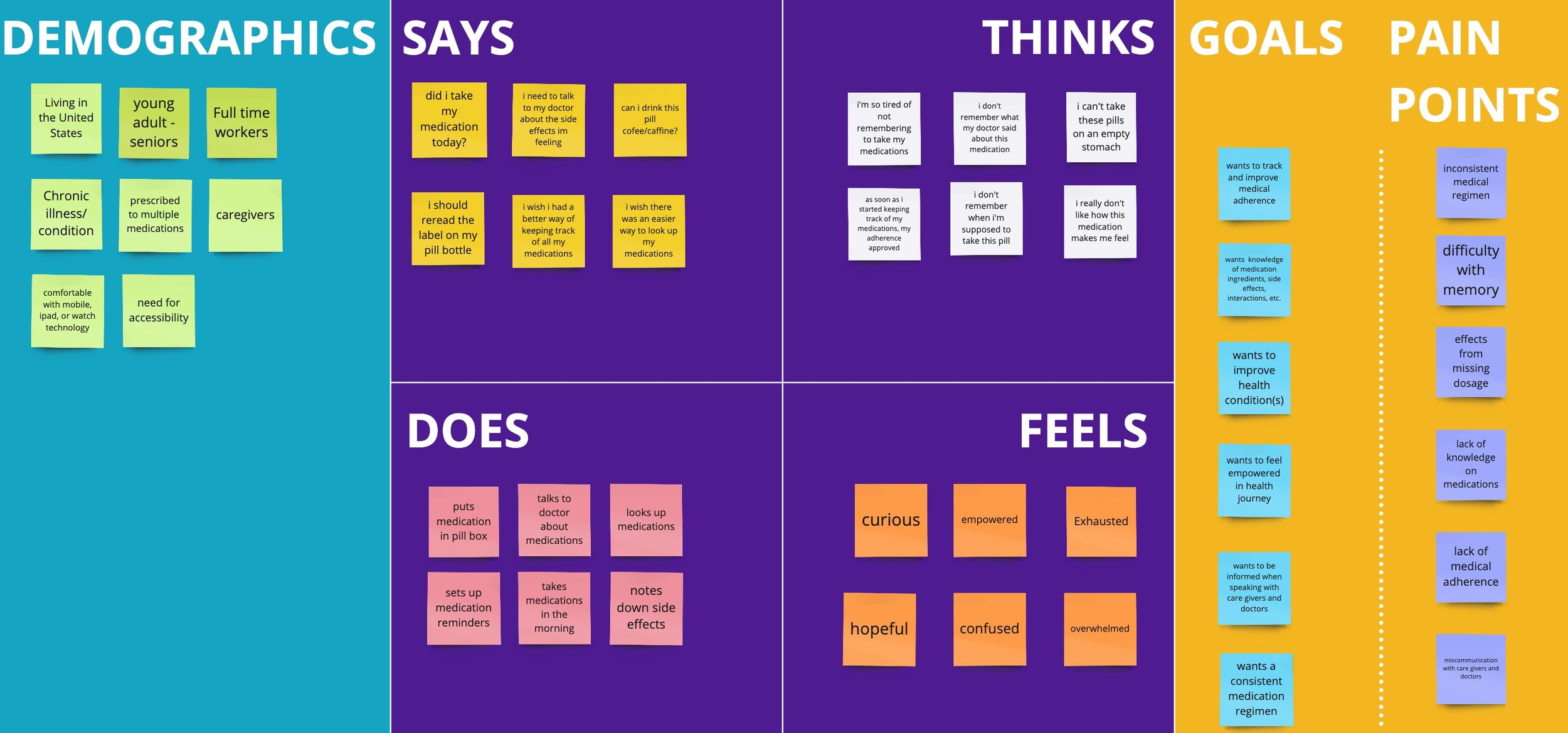
In addition, we also developed an empathy map to further understand a user’s feelings and thoughts in regards to medication management. With this, we were able to identify pain points:
Lack of knowledge about medications
Lack of medication adherence
Side effects from missing a dosage
Difficulty with memory
Lastly, our team framed a problem statement that would help guide us towards a solution:
“Individuals with chronic health issues struggle to manage their medications due to difficulties tracking multiple prescriptions, small print on medication labels, and experiencing occasional memory lapses. This results in missed doses and negatively impacts user well-being and health outcomes. How might we make it easier for individuals with chronic health issues to manage their medications effectively and prevent missed doses?”
Ideation
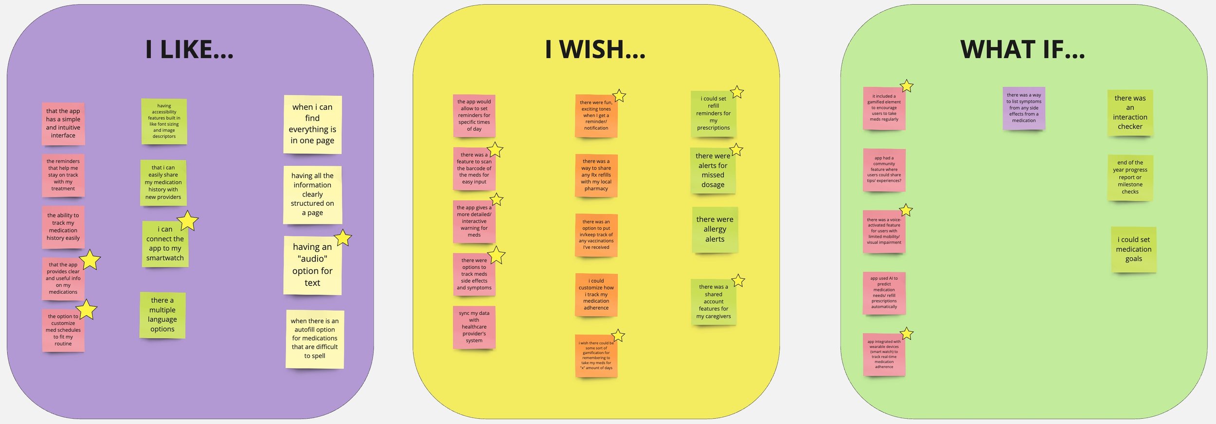
After formulating a problem statement to work towards, our team began the process of brainstorming potential solutions. We first jotted down user thoughts and feelings using the “I Like, I Wish, What If” method, then organized solutions in a feature prioritization matrix.
From here, we decided to focus on features such as medication information, adherence tracking, and voice activation, as we felt these would best serve our users.
PillPal’s Value
We also delved further into what our application aimed to accomplish by identifying user tasks, benefits users gain from using the application, and solutions for user pain points. With this, we crafted our value proposition:
“With PillPal, users can take control and feel empowered in their health management journey. They have the ability to manage medications, customize reminders and gain knowledge regarding their treatments.”
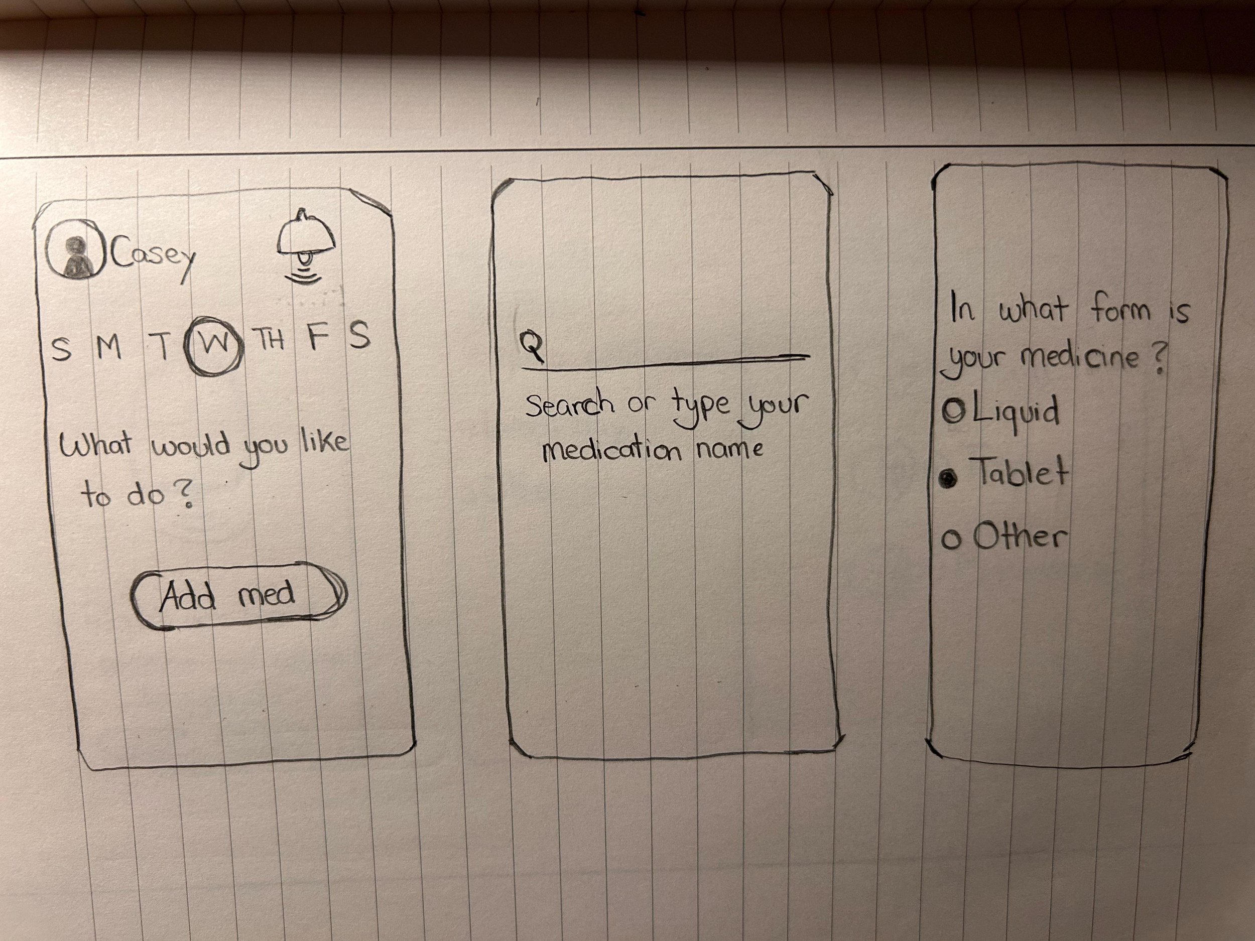
Sketches
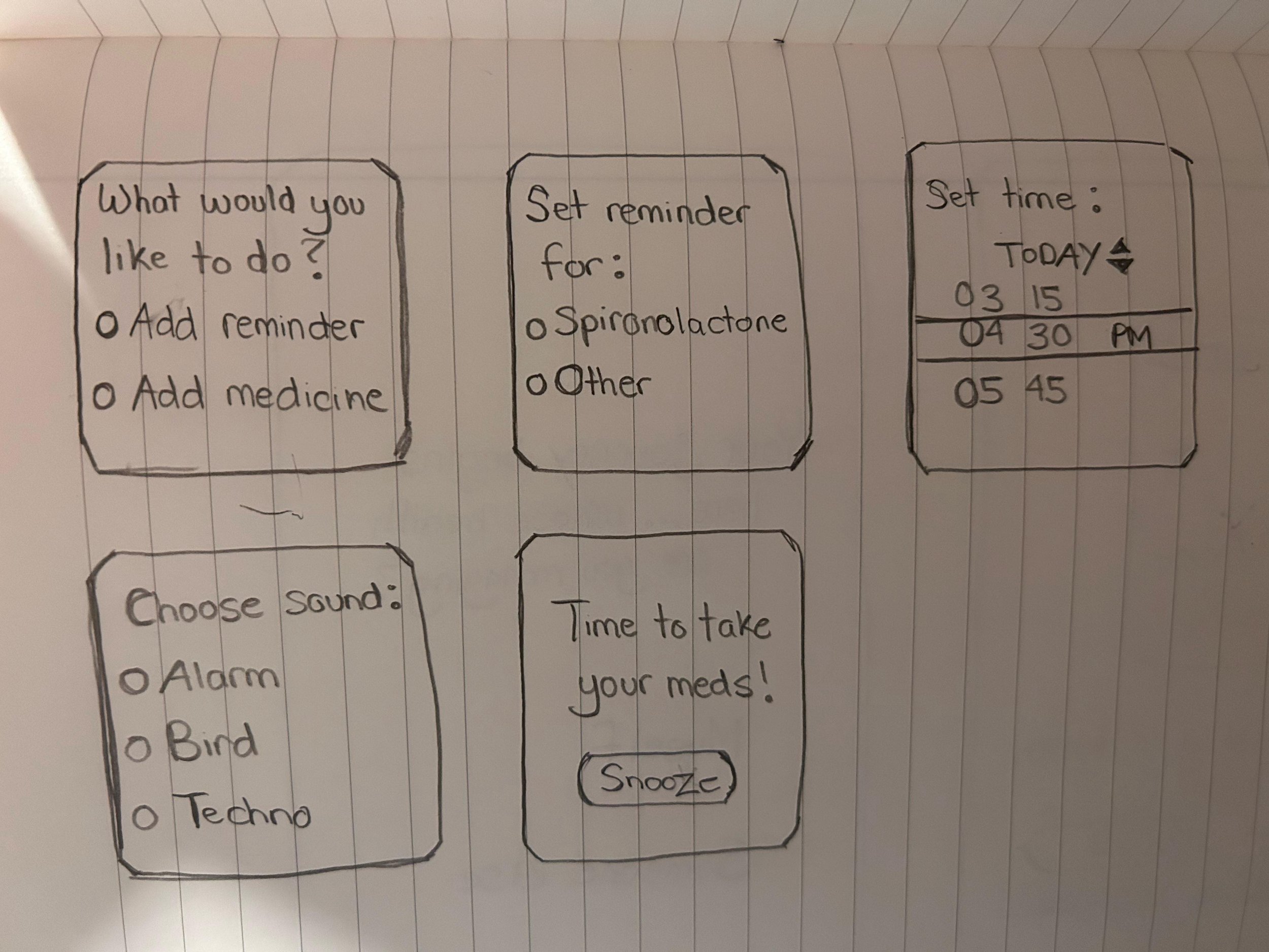
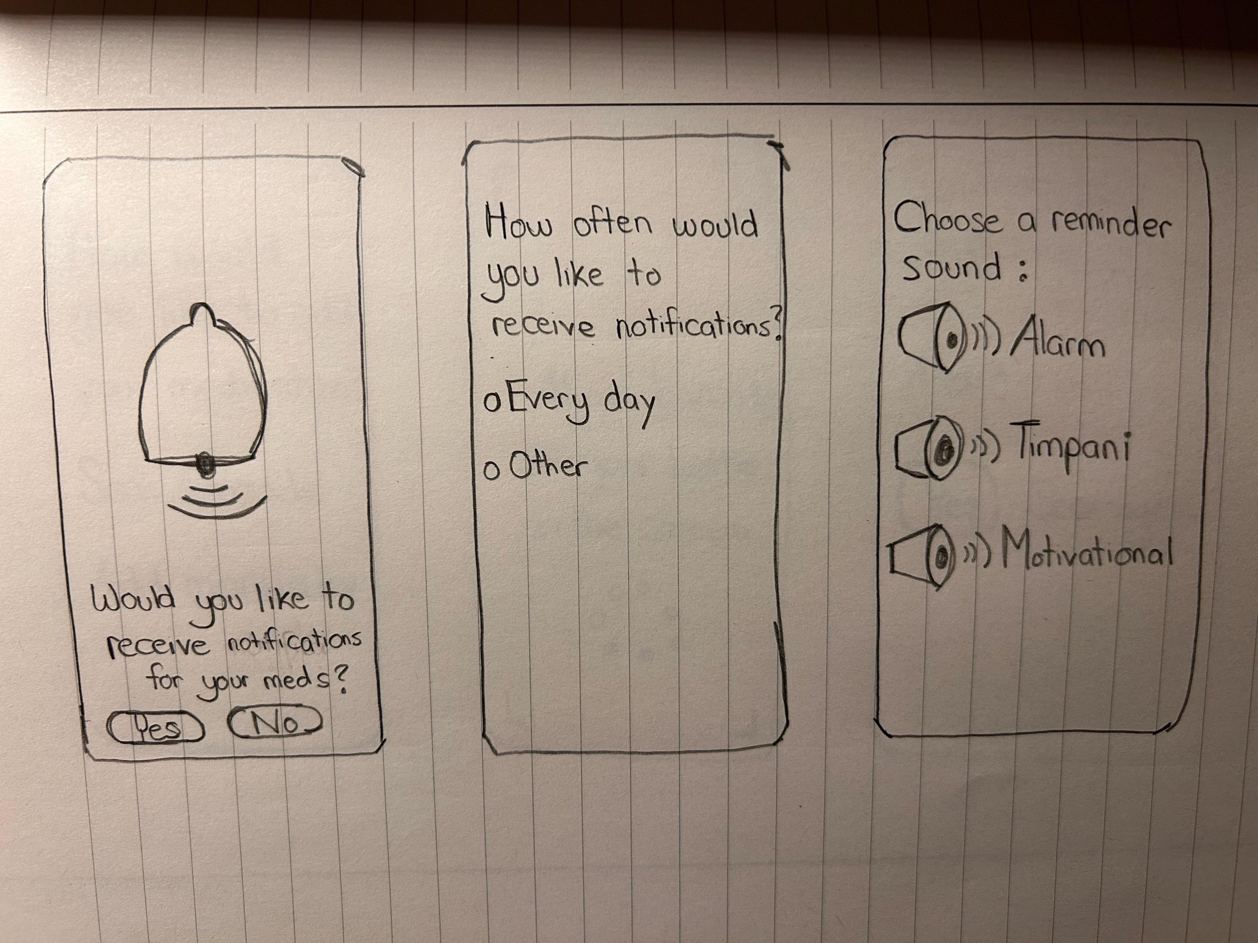
From our brainstorming sessions, our team was able to determine what screens would be essential for PillPal.
With the mobile sketches, we wanted to focus on a straightforward onboarding experience, choices for personalizing reminders, and a seamless process for adding medications. We also wanted to incorporate accessibility features, such as voice commands and the ability to scan a medication barcode using the phone camera. In regards to the sketches for smartwatches, we wanted to focus on simpler processes, such as general medication reminders.
Wireframes
Once sketches were complete, we began creating low-fidelity wireframes for mobile and smartwatch.
Style Guide
The Pill “Pal”
Our team wanted to create an aesthetically pleasing UI that balances visual appeal and user-friendliness. With our color palette, we mixed in a variety of blue colors as it represents freedom, sensitivity and stability. We also found in our competitor analysis that blue is a common color used in health & wellness applications.
Drawing inspiration from a similar medication management app called Max, we gave our user the option of choosing a “pill pal” during the onboarding process. This would serve as the user’s avatar, as well as impart a sense of companionship as the user navigates through their medication management journey.
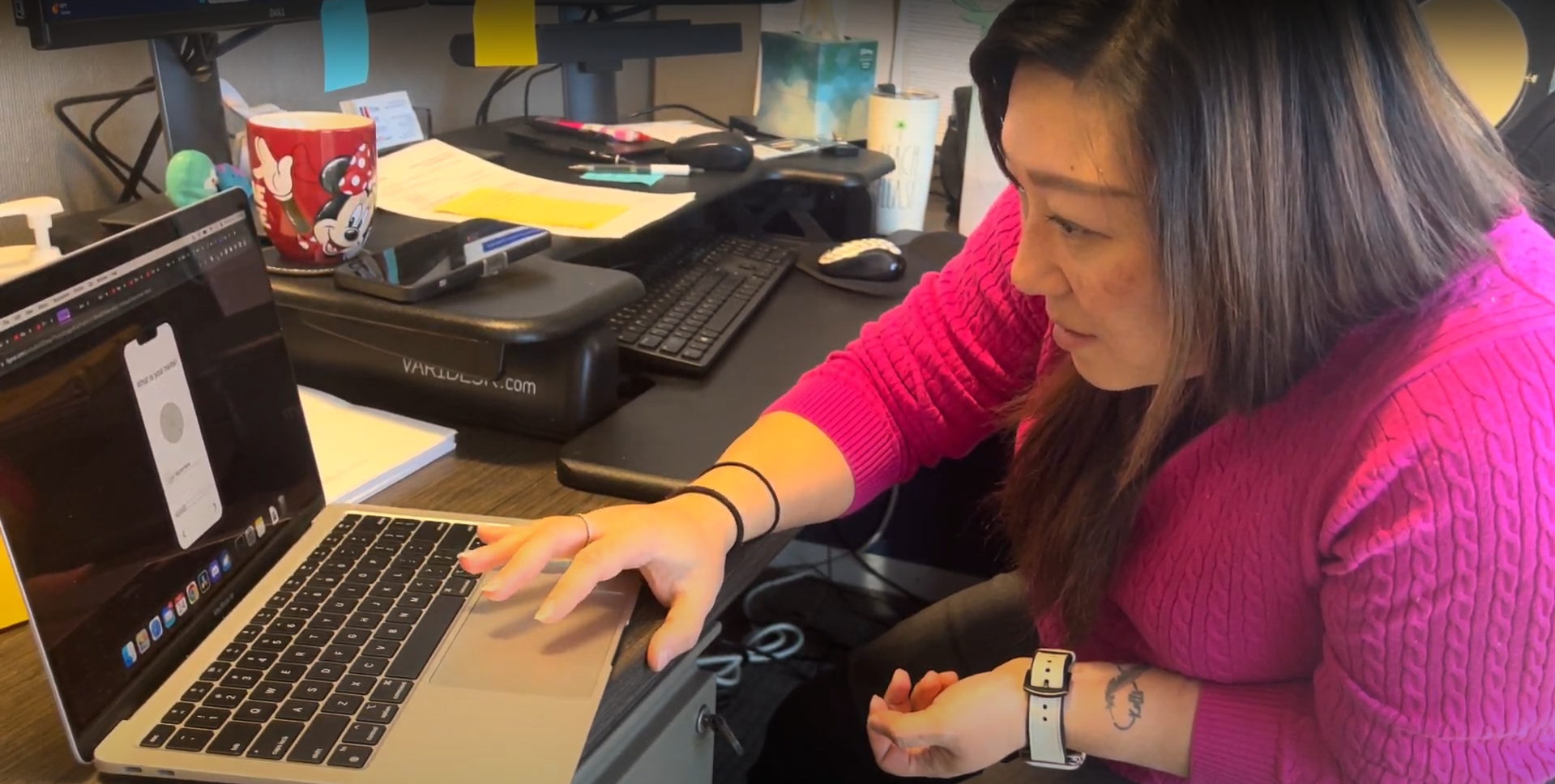
User Testing
To help us see which portions needed iterations, we conducted user tests after constructing our low and mid-fidelity prototypes to observe how users navigate throughout the application. We wanted to see if:
The user feels in control during their experience
Identify pain points with features, suggestions or iterations
A total of 8 user tests (5 after low-fidelity, 3 after mid-fidelity) were conducted. Each test took about 15 minutes through a moderated in-person session.
Tasks:
Create an account on PillPal
Add a new medication through voice command
Edit a medication via smartwatch
Mark a medication as “taken” via smartwatch
Issues our users came across included:
Confusion with adding and customizing a medication
Unclear voice interface interaction
Microcopy issues
Drawn out onboarding process
With our feedback in mind, our team focused on iterating the processes for adding medication, condensing the onboarding experience and fixing functional CTA’s.
Final Prototype
After reviewing feedback from user tests and resolving further issues, our final prototypes were created!
Final Thoughts
In the future, we would love to revisit this project and focus more on features tailored towards accessibility. We would also love to work on the current medication reminder features, build a medication information database, and connect the app to various healthcare provider systems, such as a local PCP or pharmacy.
For our team, this was a challenging yet 3 weeks of taking an idea and bringing it to life!


